Five different levels of Embedding Jasper Reports Server BI into any Custom web Application

Embedding BI is the process of adding rich data visualization and manipulation to an application by leveraging Jaspersoft’s BI suite in the design and coding of an application.

All of the following can be achieved by embedding Jaspersoft BI:
1. Reports that run on demand with output in your application or delivered in a file.
2. A repository of reports with secure role-based access, scheduling, and email delivery.
3. Interactive reports and dashboards displayed in your application.
4. Self-service ad-hoc reporting and advanced analytics integrated into your application.

b1

Based on typical user scenarios and experience with numerous real-world implementations, Jaspersoft has identified five levels of embedded BI functionality:

Level 1: Embedding of Static Reporting.
Level 2: Embedding of Managed Interactive Reports.
Level 3: Embedding of Highly Interactive Reports and Dashboards.
Level 4: Embedding of Self-Service Reporting and Ad-hoc views.
Level 5: Embedding of Advanced Analytics.

Level 1: Embedding of Static Reporting
The Jaspersoft embedded BI solution for level 1 is implemented straightforwardly with the APIs of the JasperReports Library. Using this library, applications can programmatically define a data source, use it to fill and display a report, and then export the report in any number of formats.

Reports are designed separately using the iReport or Jaspersoft Studio tools, then exported in JRXML to be bundled with the application.

Level 2: Embedding of Managed Interactive Reports
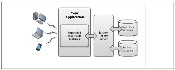
The Jaspersoft embedded BI solution for level 2 relies on web service APIs to access reports on the server. The end-user application has its own user interface, but when it wants to list or run a report, it makes calls to the server.

Web services are a set of APIs that allow the calling application to make requests for information that is processed or stored on the server. Web services use the HTTP protocol to exchange XML and JSON objects over the internet.
For example, the calling application can request a URL that represents a search of the repository, and the server responds with XML objects for each report that matched the search.

JasperReports Server implements both REST and SOAP web services, but this document focuses only on the more modern REST services.

Level 3: Embedding of Highly Interactive Reports and Dashboards
The Jaspersoft embedded BI solution for level 3 is to use iframes to display reports and dashboards that are being served directly from JasperReports Server. JasperReports Server has a web interface that creates interactive reports and dashboards in web pages in the user’s browser.

In level 3, the host application uses iframes to display the server’s pages inside of its own user interface. The embedding application only provides the placeholder for the iframe, and then users interact directly with JasperReports server within that iframe.

An iframe is an HTML element that creates an inline frame for external content. Therefore, this solution applies to a wide range of applications that are themselves web applications accessed through a browser or to applications that can display HTML in their user interface. In either case, JasperReports Server provides mechanism to customize the look and feel of its content so that the contents of the iframe blend seamlessly with the appearance of the host application.

Level 4: Embedding of Self-Service Reporting and Ad-hoc views
The Jaspersoft embedded BI solution for level 4 is to use iframes again and provide access to the Ad-hoc editor where users can access data presented through a Domain. The powerful in-memory engine of the Ad-hoc editor allows users to explore their data dynamically, by dragging and dropping columns and rows, changing summary functions, pivoting, and drilling down to detailed tables.

As in level 3, the host application uses iframes to display the server’s pages inside of its own user interface, and then users interact directly with JasperReports Server within that iframe.

Level 5: Embedding of Advanced Analytics
The Jaspersoft embedded BI solution for level 5 provides several tools for working with OLAP cubes:
1. Jaspersoft ETL (Extract, Transform, and Load) allows you to prepare and import large volumes of data automatically from any number of sources into any number of data structures, including optimized relational databases used to define OLAP cubes.
2. The schema workbench lets you define an OLAP schema for data in a ROLAP cube.
3. OLAP views combine a connection to the ROLAP cube with an MDX query to give access to the multidimensional data.

This data analysis tool lets users slice, dice, and drill down through the cubes. Advanced users can edit the MDX query to modify their view of the cube.
BigData – The Silver spoon or a hype !!

BIG data is making the buzz now-a-days. Every single enterprise, organization etc. seems to be gathering it, evaluating it, making money from it and tapping its powers. Whether we’re talking about interpreting millions of data collected for a product launch, or uncountable number of hotel packages stats to find the best time to go on vacation, big data is on the cards. The enormous data coupled with highly skilled information technology, it is a promised solution for any problem by just crunching the numbers.
Is Big Data really that Big or is it the bubble waiting to burst. There is no doubt that big data has already made a critical impact in certain areas but we need to be level headed about what big data can do and can’t.
First, big data can work as an aide to scientific inquiry but rarely succeeds as a complete replacement. Molecular biologists, for example, would like to infer the maize smut fungus structure of DNA sequence, and scientists working on the problem use big data as one tool among many. But no scientist thinks you can give a solution by only crunching data. No matter how strong the statistical analysis is, you will have to start with an analysis that relies on an understanding of molecular biology.
Second, beware of Big Errors in Big data. As the data grows so does that number of variables to be analyzed resulting in more information meaning more noise or false information. Which also means big data will also result in making false statistical relationships. It’s not that big data will always yield false information, but main challenge lies in removing noise from big data.
Third, if the results of big data analysis aren’t intentionally gamed, they often turn out to be less robust than they initially seem. We cannot solely depend on big data analysis always. It can be risky to draw conclusions from huge sets of data.
The Fourth drawback is called the echo-chamber effect. In this scenario, the source of information for a big data analysis is itself a product of big data, opportunities for error are aplenty here. Let us look at Healthcare programs. One medical company is exchanging data across all medical facilities and promoting use of electronic health records. These records can be further programmed to deliver evidence-based care. This is a good strategy, except for the fact that with some of the uncommon diseases data, many of the findings could have been made. Any initial errors in initial trends infect the analysis, which is fed back into the next research, reinforcing the error.
In a nut shell, big data is good when analyzing things that are very common, but often falls short when analyzing things that are less common.
Last but not the least is the hype created by big data. Champions of big data promote it as a revolutionary concept. Big data is certainly not revolutionary like electricity or many other important inventions which revolutionized the world. So let’s not create hype because it’s just like any other technology that we use.
Big data is here to stay and make an impact. It’s a great tool for analyzing data, but definitely not a silver spoon.

Setting up different Dataset Row Limit in JasperSoft Ad Hoc/Domain

A Domain is a virtual view, created and stored in the server without modifying the data source. Through a Domain, users see columns that have been joined, filtered, and labeled for their business needs. Security policies limit the data values users can access through a Domain. Domain presents the data in business terms appropriate to your users/audience and can limit the access to data based on the security permissions of the person running the report.

DEFTeam has gone one level ahead and we have given different row limits for each organization or tenant. Let us say when Joe user from HR organizations logs in to Jasperserver then he has access to see only 50 rows of data and when David user logs in from SALES organization he sees 1000 rows of data in ad-hoc report. Currently Jasperserver provides the setting up of max Dataset row limit at server level under following path:
Manage–> Server Settings–> Ad Hoc Settings (only admin user can set this limit).
It is a common setting across multiple tenants. When admin user set this limit, limit is applicable for every Tenant. Let us take an example. We have put 200000 dataset row limit and you can see in image given below.

1.1

DEFTeam has implemented a workaround where in admin user sets dataset row limit (in .XML file) for each user of every Tenant and our customized code reads and assigns the dataset row limit as specified by the admin. Now when any user logs into jasperserver, customized .JSP file will read the dataset row limit configuration file and assign the dataset row limit for the logged in user. If any user tries to view more rows of data the system will give the “System row limit exceeded. 20” error as shown in image below. With this workaround all changes takes place without restarting the JasperServer or its services.

1.2

There are various advantages of implementing the above functionality in Jasper. These are:
1. More detailed security. We can authorize each user with specific limits.
2. Admin user can set dataset row limit for any user of any Tenant/organization.
3. Dataset row limit for each Tenant can be achieved without applying security file to a domain.

Creating a Custom Report Template in iReport

iReport designer is a tool to make Jasper reports. Lot of us use default templates for creating reports. We might have barely noticed that custom report template is also available. In this blog we will walk you through on “How to create a custom report template”.

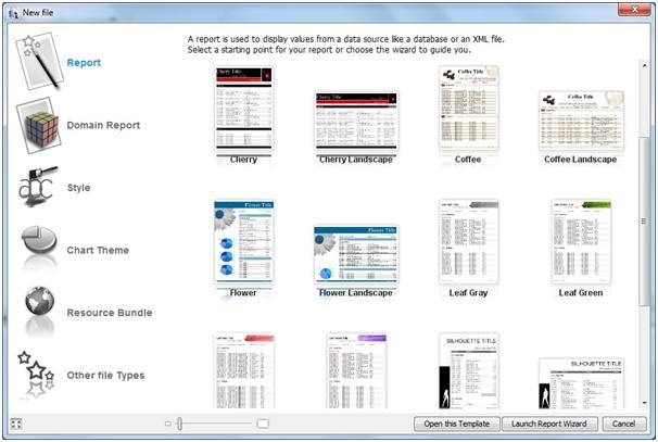
A report template is a predefined style/layout which we can use to create reports. A report template can help report designers to maintain a standard format for reports with pre defined styles and reduce the development time. Report template can also help in keeping consistency among report designs. These templates can be reused to create few standard report like invoice report, work orders and different statements (income, profit & loss etc). By using these templates we can have most of our report formatting complete even before we start developing the report. This saves a lot of time for a report author/developer. iReport gives users an option to choose from various ready to use templates. When a user selects to create a new report a prompt with predefined template is displayed, the user can either choose a new report or an existing template as shown in the below screenshot.

1
We can add these custom templates to the repository as per our convenience. Please follow the following steps to add report template to the new file editor page.
Step 1:
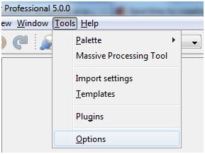
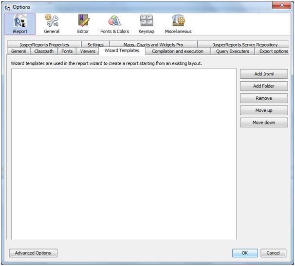
Go to Tools → Options and select iReport → Wizard Templates

2
3
Step 2:
Now we can add a report template by clicking on Add Jrxml. A report template is just a simple jrxml report with predefined styles, fonts and report bands.

4
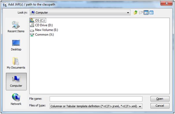
Now we can choose any existing jrxml from our machine which needs to be added in the report template repository.

Step 3:
Once the report is added to the Wizard Templates, we can see the template in the template chooser window while creating new reports and the template will be available for the report authors to use.

Best Practices For Designing Dashboards

A business intelligence dashboard is a data visualization tool that displays the current status of metrics and key performance indicators (KPIs) for an organization. Dashboards consolidate and arrange facts, metrics and performance KPI’s on a single screen. Dashboard is a tool which is easy to read, often single page, real-time user interface, showing a graphical presentation of the current status and historical trends of an organization’s key performance indicators to enable instantaneous and informed decisions to be made at a glance. It is a key to an organization’s insight. It’s an organization’s boon, but if made or used in a wrong way it’s an organization’s nightmare.

In Today’s world every big, medium and small organizations use Business Intelligence. Dashboards comprises a major chunk of Business Intelligence. It’s of uttermost importance that dashboards should reveal most important information in a precise manner. Creating dashboards is an art where there is nothing wrong or nothing right. Dashboard will show only what you want it to show. Almost every BI tool allows us to create Dashoards. Some are self service BI tools like Tableau, Qlikview where users can create their own dashboards and others are traditional tools like Jaspersoft, Pentaho, Cognos etc where BI developers creates a dashboard. No matter what who creates a dashboard, there are few key points which we should keep in mind creating it. These key points are what we call “Best Practices” for creating Dashboards and are Golden rules which we have to keep in mind to make a dashboard useful.

11082013

10 Golden rules for dashboard design:

1) Information should be concise, clear and accurate. Too little information will make the feature all but useless and too much will make for a good manager’s meeting conversation piece, but will actually render the dashboard cumbersome to use.
2) Limit the information to what’s necessary.
3) Add related KPI’s in one dashboard and select the right metrics.
4) Highlight the data which is important, like the top performers,top sellers etc.
5) Avoid too much of information on a single dashboard, it can detract the importance of the data.
6) Avoid overwhelming and distracting visuals.
7) Decide the time interval at which the data on the dashboard needs to be refreshed.
8) Always take inputs from the end users and take feedback’s.
9) Manage the real state of the dashboard effectively to avoid scrolling.
10) The dashboard should be visually appealing, effective and practical.

Clustering / Load Balancing In Jasper Reports Server

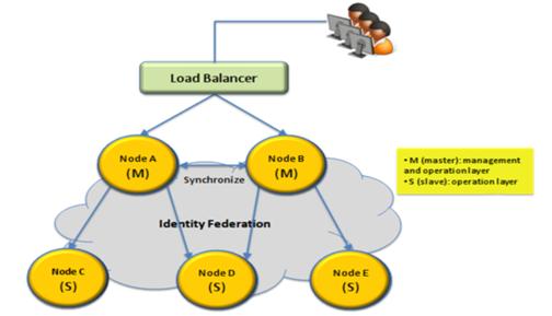
In order to deploy Jasper Reports Server in a production environment with high-availability, scalable and fault-tolerant service and provide uninterrupted services to Clients without any fail over or Downtime, DEFTeam has successfully implemented and served its customers with an ideal solution of Load Balancing of Jasper Server Repository with Database Clustering. Cluster environment contains multiple mirrored Jasper Repository Databases with one acting as a Master while the remaining as its Slaves.
blog image 1
Load Balancing can be implemented in different Databases in different approaches like in ORACLE using RAC (Real Application Cluster), PostgreSQL using PgPool or PgBouncer, MySQL with HAProxy configuration etc.
Database clustering is a bit of an ambiguous term, some vendors consider a cluster having two or more servers share the same storage, some others call a cluster a set of replicated servers.
blog image 2
Replication: It defines the method by which a set of servers remain synchronized without having to share the storage being able to be geographically disperse.
There are two main ways of going about it:
Master-Master Replication: Any server can update the database. It is usually taken care of by a different module within the database (or a whole different software running on top of them in some cases).
Downside: It is very hard to do well, and some systems lose ACID properties when in this mode of replication.
Upside: It is flexible and you can support the failure of any server while still having the database updated.
Master-Slave Replication: There is only a single copy of authoritative data, which is the pushed to the slave servers.
Downside: It is less fault tolerant, if the master dies, there are no further changes in the slaves.
Upside: It is easier to do than Multi-Master and it usually preserve ACID properties.

Change Data Capture

Change Data Capture

Change data capture (CDC) is the process of capturing changes made at data source level and applying them throughout the enterprise. CDC minimizes the resources required for ETL ( extract, transform, load ) processes because it only deals with data changes. The goal of CDC is to ensure data synchronicity.
There are four methods to handle Change Data Capture(CDC):

1. Timestamp-based CDC
Timestamp column in the source table is used to capture the date and time of the last change, whether it’s a new entry or an update to an existing row

* Simple Method
* Cannot identify deleted records

2. Trigger-based CDC
Database triggers are added to the source tables so all changes (inserts, updates, deletes) are replicated in a second set of tables specifically used for the CDC process. Only the “changed” records that are captured in the CDC tables are used to update the data warehouse during the ETL process

* Complex
* Can identify new, updated, and/or deleted records
* Suitable for low-latency (near real-time) data warehouse updates

3. Snapshot Merge
This is a simple technique where regularly scheduled table exports (“snapshots”) or staging tables are used to identify changed records. By calculating the difference between the current and previous snapshots, all new, updated or deleted records can be captured and loaded into the data warehouse

* Can identify new, updated, and/or deleted records
* Has database design and performance implications
* Not practical for very large tables unless using efficient snapshot systems
* Not suitable for low-latency data warehouse updates

4. Log Scraping
Database applications can be configured to track all activity in log files. For CDC purposes, those application log files can be scanned and parsed (“scraped”) to identify when changes occur and capture those records

* Low impact on database
* No impact on source application
* Can deliver “real-time” (very low-latency) updates to data warehouse
* Complex log formats make parsing difficult
* Log formats are different between database applications and often change

Quiz on Best practices in Data Visualization

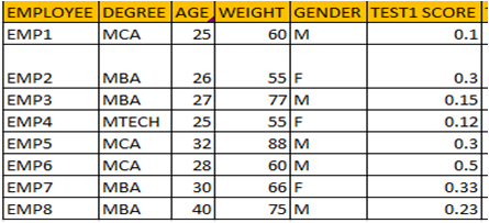
1) List all the possible combinations for drawing a scatterplot for given data
Picture3

2) Your Manager has asked you to make a presentation which will showcased to more than 100 people. Which color palette would be more appropriate for the given audience.
Picture4

3) Which color palette would you choose for making heatmap.
Picture1

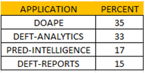
4) For the given data which chart type would you choose
Picture2

5) Do you think 3D charts should be used in Data Visualization.

Answers are given below.
1) Scatterplot is drawn between two quantitative variables. So combinations is – Age&Weight,Age&TestScore1, Weight&TestScore1

2) Option B. 10-12% of the people are colorblind. So we have to choose color palette which is color blind friendly.

3) Option A.

4) Horizontal Column chart.

5) 3D Charts are not preferred as they are hard to read and interpret.

Data Visualization Best Practices : Part 2 – Choosing line chart or Bar chart.

Line and bar charts are the most common type of charts used in BI reports and dashboards. In the given figure below there are three line charts. Try to figure out which of these charts are inappropriate.

Line charts should be used when quantitative variables change over a period of time, as it help’s in discovering trends.
In the first two charts the x axis is represented by categorical variables which are nominal (Chart A) and ordinal (chart B) in nature.
Bar Chart are preferred for qualitative variables as they help in making comparison across different categories.
In the first two charts bar chart should be used instead of line chart, as trends across different categories does not help in decision making.
Third chart(chart C) helps in discovering upward trend for the measure used over a period of time. So line chart should be preferred based on best practices.

For given dataset different visualizations can be used but not all visualization helps in making better decisions. So it’s recommended to follow best practices.

In the next post we will post series of charts and you have to decide which chart type to use based on best practices.

Data Visualization Best Practices : Part 1 – Choosing the right colors for bar charts

Bar charts are the most commonly used charts in Business Intelligence reports and Dashboards. They are useful in summarizing the categorical variables or qualitative variables where the length of the bar is directly proportional to value they represent. This post is one of many posts related to best practices in data visualization. In this post we will learn which color pallete should be used in bar charts.

Let us assume a company is manufacturing 4 products namely A,B,C,D and your manager want to see the sales of these product during 2012 using a bar chart.Which bar chart would you choose?

Untitled

In the first bar chart all the four bars are represented by four different colors. Most of the people will be tempted to use this bar chart as it looks attractive.Actually the colors in the bar do not convey any meaning and tends to confuse the user as user searches for meaning for each color resulting in wastage of time.

Color scheme followed in the third bar should be avoided as this color scheme is best suited for plotting the heatmap. In this color scheme order plays an very important role. Color with lower shades represents a variable with less value and color with high intensity represents the variable with high value. So this color scheme should be avoided in bar charts.

Based on the best practice second bar chart is recommended as all bar charts are represented by same color, It makes easy for user to compare values across all bars.